Best Cinematography 2010
Runners-up
#8 -- Robert Richardson - Shutter Island
#7 -- Wally Pfister - Inception
#6 -- Roger Deakins -- True Grit
And the Top Five Are...
#5 -- Danny Cohen - The King's Speech
Even in a simple three-shot, there's always something interesting to look at onscreen. Credit in part must go to director Tom Hooper, but I remember thinking that nearly every shot of The King's Speech looked really cool thanks to lighting, set design, and the placement of the actors on the screen.
#4 -- Pawel Edelman - The Ghost Writer
Perhaps the richest looking of all the selections, The Ghost Writer contains some beautiful shots like the one above. The last shot of the film (which may or may not pop up in the Best Scenes of the year category) is another stunning set piece.
#3 -- Matthew Libatique - Black Swan
As time has passed, my feelings for this film have lessened even more than the lukewarm response I initially gave it. That said, the film looked great. Personally, I loved the grainy look that was achieved and I found the lighting in nearly every scene (those that featured the characters onstage and off) was particularly spot-on.
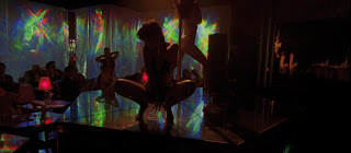
#2 -- Benoît Debie - Enter the Void
Apparently, slot #2 of the Cinematography Award goes to the weirdest film I see in a given year. Last year, this spot went to Antichrist, and this year, the strange Enter the Void takes the runner-up spot. Dark, edgy, and grittily urban, this movie falters in its script, but succeeds in everything it attempts visually.
#1 -- Martin Ruhe - The American
Like #2 above, The American is not going to be everyone's cup of tea. It's slow-moving and oddly paced, but Martin Ruhe manages to take the most simplistic of shots and make them look great, helping to keep the eye visually stimulated while the story takes its time to unfold.


No comments:
Post a Comment