Runners-up
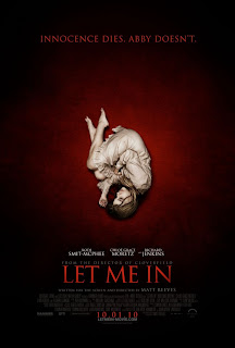
A trio of horror flicks that use different tactics to get across their aire of unease.
The top ten come after the jump...
#10 -- The Social Network
You already start to get the hint of Zuckerberg's feelings of isolation from the poster.
#9 -- All Good Things
Probably the most generic of any of the posters in the top ten, but I love the stark contrast of white and red, with the dripping blood forming the outline of New York City. I know it's not necessarily anything new, but it really works for me here.
#8 -- Piranha 3D
Aah...the French. Blunt (the "SEA, SEX, and BLOOD" pretty much tells you all you need to know about the movie) and unafraid of showing a little skin (even in their posters). Love the throwback look to the cheesy exploitation films that this flick glorifies.
#7 -- Rabbit Hole
I've yet to see this one, but I love the poster. The fragmented images showcase the different emotions the distraught parents are going through in the film.
#6 -- Animal Kingdom
Once again, I haven't seen this one, but there's something about the poster above that's unusual and gritty.
#5 -- I Am Love
If you look closely, you'll see that the elaborate cursive writing is covering up the faces of everyone but Tilda Swinton. Seeing as how her character abandons her family to fulfill her desires, the poster seems very apropos.
#4 -- Buried
A Hitchocockian tribute to Saul Bass.
#3 -- Black Swan (collection)
I really like the American poster on top with the fragmented fragile ballerina, but I really swooned over the artistic quartet of Polish-inspired posters. (In Poland, many films have their posters hand-drawn.)
#2 -- The Fighter
I don't know why, but there's something incredibly striking in the simplicity of the poster above.
#1 -- The American
Retro...orange...Clooney looking angry. Love the silhouette of the man falling backwards in the midst of the title. All-around classy.


No comments:
Post a Comment